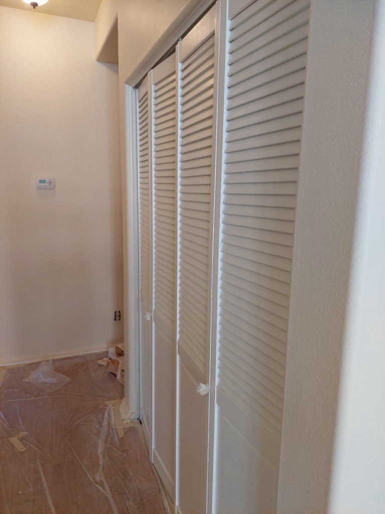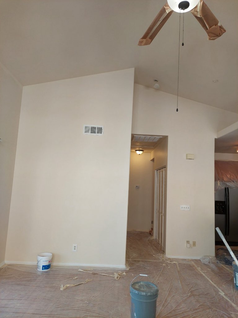
Neutral colors have long been a staple in interior design, offering a sense of calm, sophistication, and versatility.
But when it comes to commercial spaces, are they the right choice?
Let’s take a look at the pros and cons of incorporating neutral hues into your business environment.
Pros of Using Neutral Colors in Commercial Spaces

Creates a Versatile Foundation: Interior paint colors like white, gray, beige, and black provide a blank canvas that can easily adapt to changing trends and brand identities. You can easily redecorate with vibrant accents, artwork, and furniture without feeling overwhelmed. This flexibility is essential for businesses that may need to rebrand or update their aesthetics over time.
Enhances Brand Consistency: Neutral colors can subtly reinforce your brand identity. For instance, a law firm might opt for cool grays and crisp whites to convey professionalism and trustworthiness, while a tech startup could embrace a minimalist aesthetic with clean lines and stark whites.
Promotes Focus and Productivity: Neutral colors have a calming effect on the mind, reducing distractions and promoting a sense of focus and productivity. This is particularly important in office environments where employees need to concentrate on their work.
Increases Natural Light: Light interior paint colors, such as white and off-white, reflect light effectively, making your space feel brighter and more spacious. This is especially beneficial for spaces with limited natural light, such as basements or inner offices.
Appeals to a Wider Audience: Neutral colors are generally considered inoffensive and appeal to a broad range of tastes.
Cons of Using Neutral Colors in Commercial Spaces

Can Feel Bland and Uninspiring: An overreliance on neutral tones during your commercial painting project may result in a commercial space that feels sterile and devoid of energy. While minimalist aesthetics are often praised for their clean and streamlined look, too much white can give off a cold, clinical vibe reminiscent of hospitals or office lobbies. Similarly, excessive gray tones may cast a somber, gloomy atmosphere, which could negatively affect the mood of both customers and employees. Striking the right balance by incorporating accent colors or textures is essential to maintain visual interest.
May Lack Personality: Commercial spaces are often an extension of a brand’s identity, and neutral interior paint color schemes may fall short of creating a memorable or impactful experience for visitors. Spaces designed solely in beige, taupe, or white can blend into the background, making it harder for customers to associate a unique identity with the business. Adding pops of color, branded graphics, or unique design elements can help a business stand out and foster an emotional connection with customers.
CanBe Difficult to Maintain: While light and neutral colors can make a space look open and clean, they also tend to show dirt, scuff marks, and stains more prominently. This can be a major issue in high-traffic areas such as restaurants, cafes, and retail stores where surfaces endure constant use. Businesses may find themselves spending more time and money on frequent cleaning, touch-ups, and repainting to keep the environment looking pristine. Opting for durable finishes or stain-resistant materials can help mitigate this challenge.
Design Tips for Successful Neutral Color Implementation

1. Create Visual Interest with Textures
Neutral color schemes can sometimes feel flat or monotonous without proper layering in commercial painting projects. Elevate the aesthetic by introducing textures through materials like wood, brick, metal, or woven elements. For example, a white living room becomes more dynamic with a wooden coffee table, brick accent wall, or plush woven rug. Don’t shy away from textured wallpapers or fabric furnishings, as they add both depth and a tactile element.
2. Incorporate Bold Accents
Neutral doesn’t have to mean boring. Adding pops of color through furniture, artwork, plants, and decorative accessories helps inject personality and vibrancy into the space. Consider throw pillows in vibrant patterns, a bold abstract painting, or even colorful plant pots. These accents can easily be swapped out over time to refresh the look without a complete overhaul.
3. Use Lighting Strategically
Lighting plays a major role in enhancing a neutral palette by setting the mood and highlighting textures and focal points. Layer different types of lighting for maximum impact. Task lighting (like desk lamps) ensures functional brightness, ambient lighting (like ceiling fixtures) offers overall illumination, and accent lighting (like wall sconces or track lights) emphasizes specific features, such as textured walls or statement pieces.
4. Consider the Space’s Function
Neutral tones should be chosen based on the purpose and atmosphere of the space. Warm neutrals such as beige, cream, and taupe create a cozy and welcoming vibe, ideal for residential spaces or intimate cafés. Conversely, cooler hues like greys and whites contribute to a sleek, modern aesthetic, making them perfect for offices and commercial environments where focus and professionalism are key.
5. Consult with a Commercial PaintingProfessional
If you’re uncertain about finding the right balance or achieving your design goals, an interior designer can help craft a color scheme that reflects your style or brand identity while meeting the functional requirements of your space. Professionals can also guide you on material selection, lighting strategies, and layout optimization to ensure a harmonious and visually engaging design.
With careful planning and thoughtful touches, neutral color schemes can be anything but dull, creating spaces that are elegant, versatile, and timeless.
Neutral colors can be a valuable asset in commercial spaces when used thoughtfully and strategically. By carefully considering the pros and cons and implementing the design tips outlined above, you can create a sophisticated and inviting environment that promotes productivity, enhances your brand image, and appeals to a wide range of customers.
If you’re located in Orange County and looking for experienced commercial painters, look no further than Silver Star Painting.
We offer the most professional commercial and residential painting services, ensuring a flawless finish and a truly transformative experience for your commercial space.
Our range of services includes color consultations, stucco repair, power washing, ceiling resurfacing, cabinet resurfacing, and much more.
Reach out to us today for more details about our painting company.