2025 is shaping up to be a year of vibrant expression and nuanced sophistication in home decor.
Gone are the days of bland neutrals; this year, it’s all about embracing bold choices and creating spaces that reflect individual personalities.
Here are some of the hottest 2025 color trends that are set to dominate the design scene:
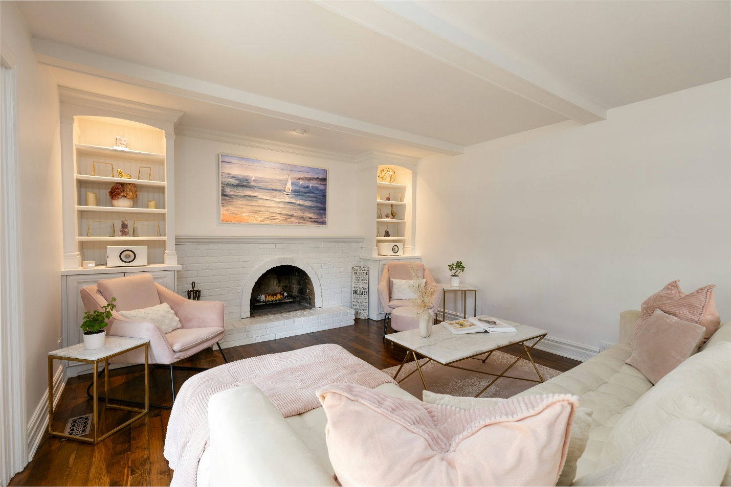
1. Earthy Neutrals with Vibrant Accents

This captivating color palette seamlessly blends timeless elegance with a touch of unexpected drama. It’s a harmonious fusion of soothing neutrals and exhilarating pops of color, creating a space that is both sophisticated and inviting.
The Foundation: Earthy Neutrals
Warm Terracotta: This rich, earthy hue evokes the warmth of the sun and adds a touch of rustic charm.
Deep Olive Green: A grounding and sophisticated shade that brings a sense of tranquility and nature indoors.
Muted Terracotta: A softer, more subdued version of terracotta, offering a gentle warmth and versatility.
The Unexpected: Vibrant Accents
To inject personality and energy, introduce vibrant accents that play against the neutral backdrop.
Emerald Green: A luxurious and sophisticated hue that adds a touch of opulence and brings a sense of life and vibrancy.
Sapphire Blue: A deep and dramatic shade that adds a touch of mystery and intrigue.
Amethyst Purple: A regal and enchanting color that adds a touch of magic and wonder.
Material Harmony: Natural Elegance
To complete the look, pair these interior paint colors with natural materials that complement the earthy tones and create a balanced, organic feel.
Wood: Warm wood tones, such as oak or walnut, add warmth and texture, creating a sense of coziness and inviting warmth.
Linen: Soft and breathable linen adds a touch of effortless elegance and complements the natural aesthetic.
Rattan: Woven rattan brings a touch of bohemian chic and adds a sense of lightness and airiness.
Overall, this palette is a versatile and captivating option for any space that desires a blend of timeless elegance, organic warmth, and unexpected drama.
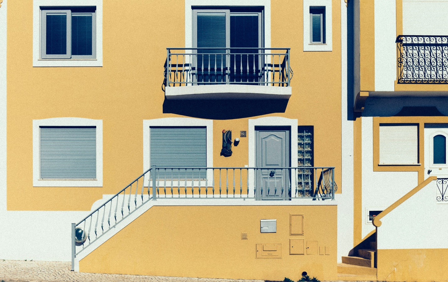
2. The “Sundrenched” Palette

Inspired by the warmth of the sun, this interior paint color palette evokes feelings of joy and relaxation.
Base: Soft, golden yellows, creamy whites, and sandy beiges create a warm, inviting backdrop.
Accents: Add pops of sunny yellow, burnt orange, and terracotta for a touch of vibrancy.
Materials: Incorporate natural fibers like jute and sisal, and use plenty of natural light to enhance the effect.
3. The “Moody” Palette
For those who yearn for an interior that exudes a sense of intrigue and sophistication, the “Moody” Palette is an irresistible choice.
This palette is a celebration of deep, rich hues that evoke a sense of mystery and depth, perfect for creating a dramatic and captivating ambiance.
A Foundation of Depth
The foundation of this palette rests on a harmonious blend of deep, inky blues, charcoal grays, and forest greens. These colors create a sense of intimacy and tranquility, inviting you to unwind and escape the everyday. Imagine walls painted in a deep navy or charcoal, adorned with artwork featuring rich emerald greens and sapphire blues.
Introducing Glamour
To elevate this moody foundation, introduce a touch of unexpected glamour with metallic accents. Gleaming gold, warm copper, and cool brass add a touch of luxury and warmth, breaking up the darker tones and creating points of interest. Consider incorporating metallic finishes in light fixtures, decorative accessories, or even through the use of metallic wallpaper.
3. The “Biophilic” Palette

Drawing inspiration from the natural world, the “Biophilic” Palette is designed to promote a sense of tranquility and well-being within your home.
This palette celebrates the soothing hues and textures found in nature, creating a serene and restorative environment that connects you with the outdoors.
A Foundation of Calm
The foundation of this palette rests on a harmonious blend of soft greens, calming blues, and earthy browns. These colors evoke a sense of peace and relaxation, reminiscent of lush forests, tranquil oceans, and fertile earth. Imagine walls painted in a soft sage green, complemented by calming blues on accent walls or upholstery. Earthy browns can be incorporated through natural wood flooring or furniture pieces.
5. The “Retro Revival” Palette
This playful palette draws inspiration from the vibrant colors of the 1970s.
Base: Mustard yellow, burnt orange, and olive green create a retro-inspired foundation.
Accents: Introduce pops of vibrant pink, turquoise, and chartreuse for a playful touch.
Materials: Embrace vintage-inspired patterns and textures, such as geometric prints and textured fabrics.
Tips for Incorporating These Palettes
Start with a Mood Board
Visual Inspiration: Begin by collecting images of rooms, furniture, and artwork that resonate with you. Pinterest, Instagram, and interior design magazines are excellent sources of inspiration.
Color Identification: As you browse, pay close attention to the colors that catch your eye. Note down the specific hues and how they are combined in each image.
Mood and Style: Consider the overall mood you want to create – is it calming, energetic, luxurious, or playful? The colors you choose should reflect this desired atmosphere.
Test Colors
Lighting is Key: The appearance of colors can vary significantly depending on the lighting in your space. Paint swatches on your walls and observe how they look in different lighting conditions throughout the day (morning, afternoon, and evening).
Consider Undertones: Pay close attention to the undertones of the colors you’re considering. For example, a gray might have blue, green, or purple undertones, which can dramatically affect the overall feel of the room.
Live with the Color: Before committing to a large area, try living with the color for a few days. This will help you understand how the color makes you feel and how it interacts with the existing decor.
3. Mix and Match
Break Up Monotony: Don’t be afraid to combine different shades within a palette to create visual interest and depth. For example, you could pair a deep navy blue with a lighter shade of blue-gray for a sophisticated and layered look.
Create a Focal Point: Use a bolder color or pattern to create a focal point in the room. This could be an accent wall, a piece of furniture, or a large area rug.
Personalize Your Space: The key is to create a space that reflects your unique personality and style. Don’t be afraid to experiment and have fun with the process.
Finding the Right Residential and Commercial Painters in Orange County
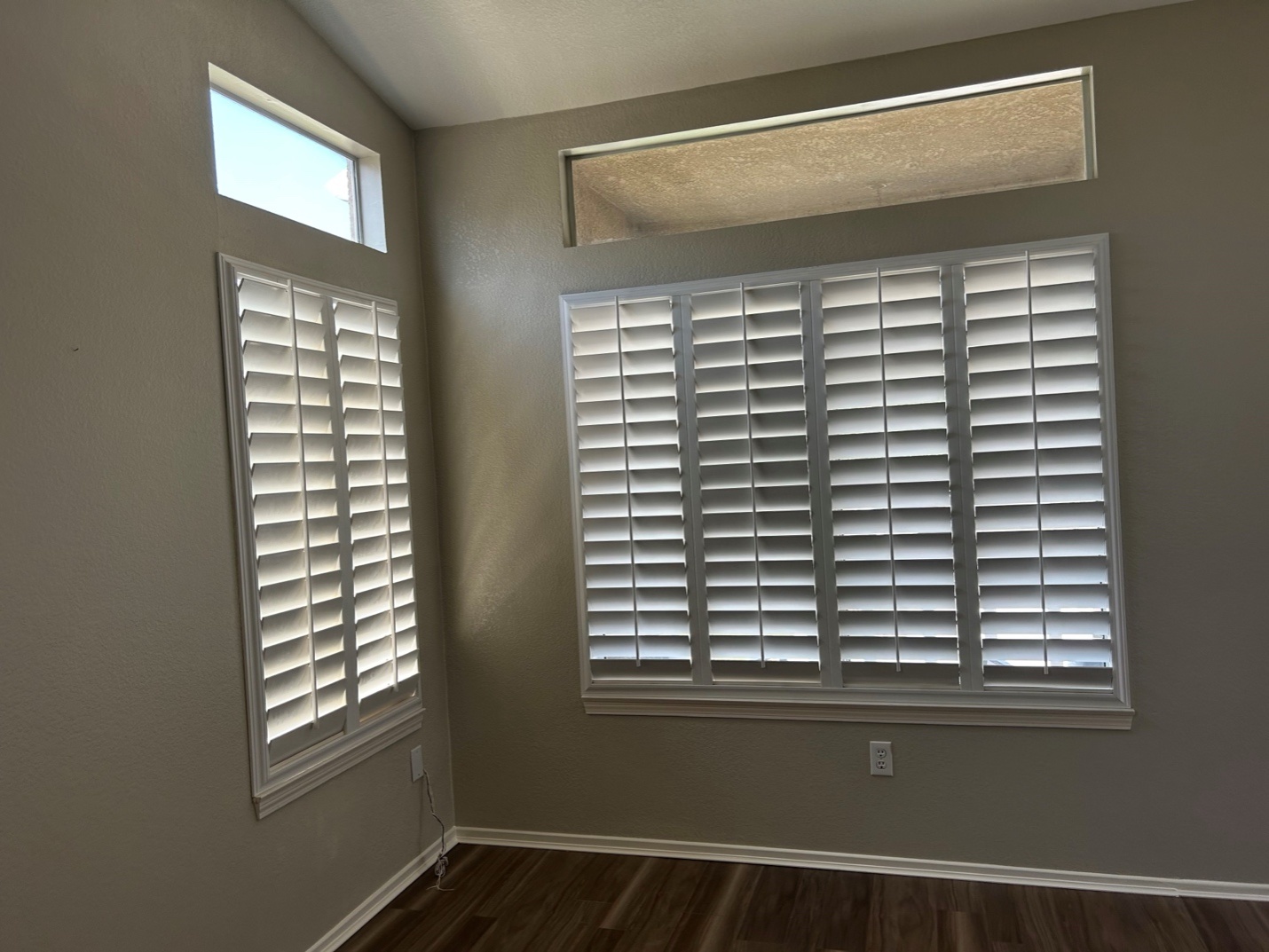
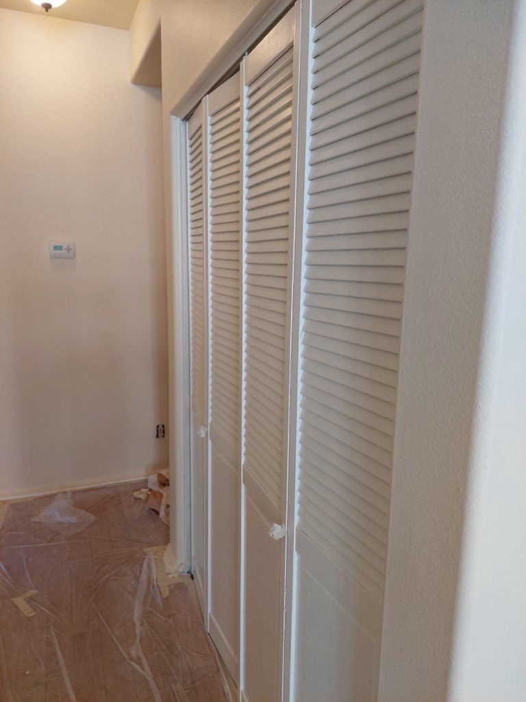
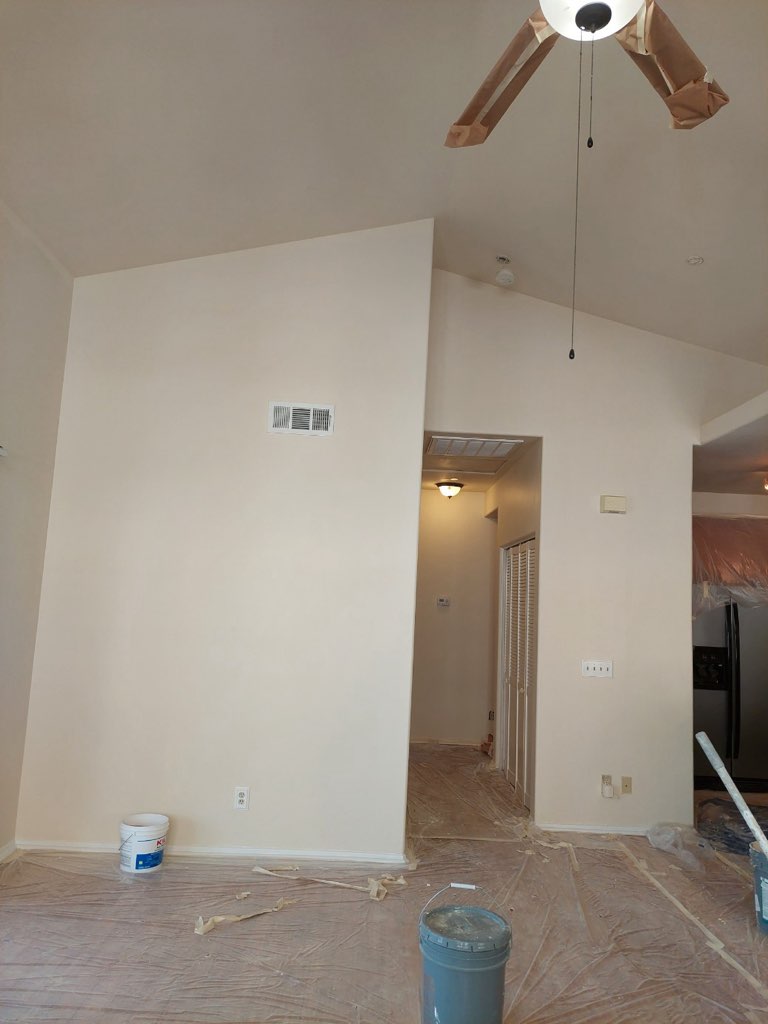
If you’re looking to refresh your home’s interior or exterior with these vibrant new paint colors, consider hiring professional painters.
Silver Star Painting offers the most professional commercial and residential painting services in Orange County.
Our experienced team can help you choose the perfect colors and execute flawless painting projects. From power washing services and acoustic ceiling removal to professional ceiling resurfacing, we can handle it all.
Reach out to us at any time for more details about our painting company.