The color of your walls can have a surprising impact on the mood and productivity of your employees.
Choosing the right paint colors for your commercial space is more than just aesthetics; it’s an investment in a positive and productive work environment.
Understanding the Psychology of Color

Before you start browsing paint swatches or planning a room’s design, it’s essential to understand how color can influence mood, emotions, and even behavior.
Different colors evoke unique psychological responses, making your choice of palette a powerful tool for shaping the atmosphere of a space.
Let’s take a look at the psychology of color to help you make informed decisions that align with your goals for each room.
Cool Colors
Cool colors are often associated with calmness, serenity, and balance, making them ideal for spaces where relaxation or focused work is a priority.
Blue: Known for its calming properties, blue can create a tranquil and soothing environment. It’s often used in bedrooms and offices, as it can reduce stress and promote focus. Lighter shades of blue can make a room feel open and airy, while darker blues exude a sense of authority and reliability.
Green: As a color tied to nature, green brings a sense of renewal and relaxation. It’s an excellent choice for home offices, libraries, or creative spaces, where its calming yet invigorating effect can inspire fresh ideas and enhance problem-solving abilities.
Purple: Historically associated with royalty and luxury, purple can add a touch of sophistication to any room. Lighter shades, like lavender, are soft and calming, making them perfect for bedrooms, while deeper hues, like plum, inspire creativity and make bold design statements.
Warm Colors
Warm colors can create energy, warmth, and vibrancy, making them ideal for social spaces or areas where motivation and excitement are key.
Red: Bold and dynamic, red commands attention and energizes a space. It’s great for dining rooms or areas where you want to spark conversation and activity. However, use it sparingly—too much red can feel overwhelming or even provoke anxiety.
Yellow: Bright and cheerful, yellow can infuse a room with optimism and joy. It’s often used in kitchens or playrooms to promote mental activity and a welcoming atmosphere. Soft yellows create warmth, while brighter shades energize.
Orange: A blend of red’s energy and yellow’s happiness, orange stimulates creativity and fosters excitement. It’s a great choice for workout rooms or creative studios. Muted oranges can create a cozy and inviting living space.
Neutral Colors
Neutral tones provide a versatile backdrop, setting the stage for more prominent design elements or creating a serene environment on their own.
White: A timeless choice for creating a sense of cleanliness and spaciousness. White walls make small rooms appear larger and work well in minimalist or modern designs. Pair it with pops of color for added vibrancy.
Gray: A sophisticated and adaptable choice, gray can evoke calm or energy depending on the undertone. Light grays can make a room feel airy, while dark grays create a more dramatic, intimate vibe.
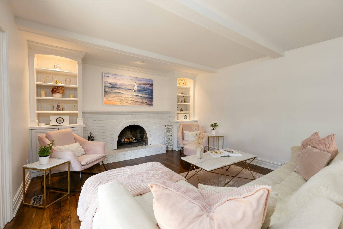
Beige: Warm and inviting, beige is a classic neutral that pairs well with almost any accent color. Its versatility makes it a popular choice for living rooms and bedrooms where a cozy atmosphere is desired.
Bringing It All Together
When choosing paint colors, consider the function and feel of each room.
Want to foster productivity in your home office? Opt for cool tones like blue or green.
Looking to energize your workout space? Incorporate shades of orange or red.
For a calming retreat in your bedroom, neutrals or soft pastels can set the perfect tone.
By understanding the psychology of color, you can create a harmonious home environment that enhances both style and mood.
Factors to Consider When Choosing Paint Colors

Industry and Company Culture
Creative Industries: Consider vibrant colors like orange, yellow, or turquoise to encourage creativity and innovation.
Tech Companies: Opt for cool colors like blue or green to promote focus and concentration.
Financial Institutions: Choose neutral colors like gray or beige to convey a sense of professionalism and stability.
Room Function
Reception Areas: Use welcoming colors like warm yellows or soft greens to create a positive first impression.
Break Rooms: Opt for cheerful colors like orange or yellow to encourage social interaction and relaxation.
Conference Rooms: Choose calming colors like blue or green to facilitate productive meetings.
Lighting
Consider the natural and artificial lighting in each room. Darker colors can make a space feel smaller and more cramped in low-light conditions.
Lighter colors can brighten up dark spaces and make them feel more spacious.
Employee Preferences
Consider surveying your employees to get their input on preferred color schemes.
Involving employees in the decision-making process can boost morale and create a sense of ownership.
Accessibility
Ensure that the chosen colors are accessible to people with visual impairments.
Consider using color contrast effectively to improve readability and navigation.
Creating a Color Palette
Start with a Neutral Base
- Use neutral colors like white, gray, or beige as a base for your color palette.
- This will provide a clean and consistent backdrop for bolder accent colors.
Add Accent Colors
- Introduce accent colors strategically to create visual interest and define different areas within the space.
- Consider using accent walls, furniture, or artwork to incorporate these colors.
Consider the 60-30-10 Rule
- This rule suggests using 60% of the space for a dominant color, 30% for a secondary color, and 10% for an accent color.
Tips for Successful Color Implementation

Create a Mood Board
Gather paint swatches, fabric samples, and images that reflect the desired mood and aesthetic.
This will help you visualize how different colors will work together.
Test Colors
Paint large swatches of the chosen paint colors on the walls to see how they look in different lighting conditions.
Observe how the colors make you feel throughout the day.
Consult with a Professional
Consider hiring a professional interior designer or color consultant to guide you through the color selection process.
Maintaining Your Paint Job
Regular Cleaning
Regularly clean walls to prevent dirt and grime from dulling the colors.
Use appropriate cleaning solutions based on the type of paint.
Touch-Ups
Touch up any chips or scratches promptly to maintain a professional appearance.
Boosting Productivity with the Right Paint Colors
By carefully considering the psychology of color and the specific needs of your business, you can create a work environment that is both visually appealing and conducive to productivity.
If you’re looking to get professional painting services in Orange County, check out Silver Star Painting.
Our team of well-trained and skilled interior painters can help you bring your vision to life and create a stunning and functional workspace for your employees. From apartment painting services and drywall patching and finishing, we can handle it all.
Contact us today for more details.